Teamspace: Transforming a failing platform into a central hub for 10,000+ employees
From 40 weekly users to 85%+ platform adoption across 10,000+ team members. I led the strategic reset that transformed Teamspace - Woolworths' employee hub for news, HR and everyday tasks - from a failing platform into the central hub for support staff - earning internal innovation awards two years running and creating a scalable model now used across the entire 200,000+ store network.
My role: Senior UX Designer leading strategy and design.
Research • Product Strategy • UX Design • Information Architecture •Prototyping • Content Design
The challenge: a platform at a standstill
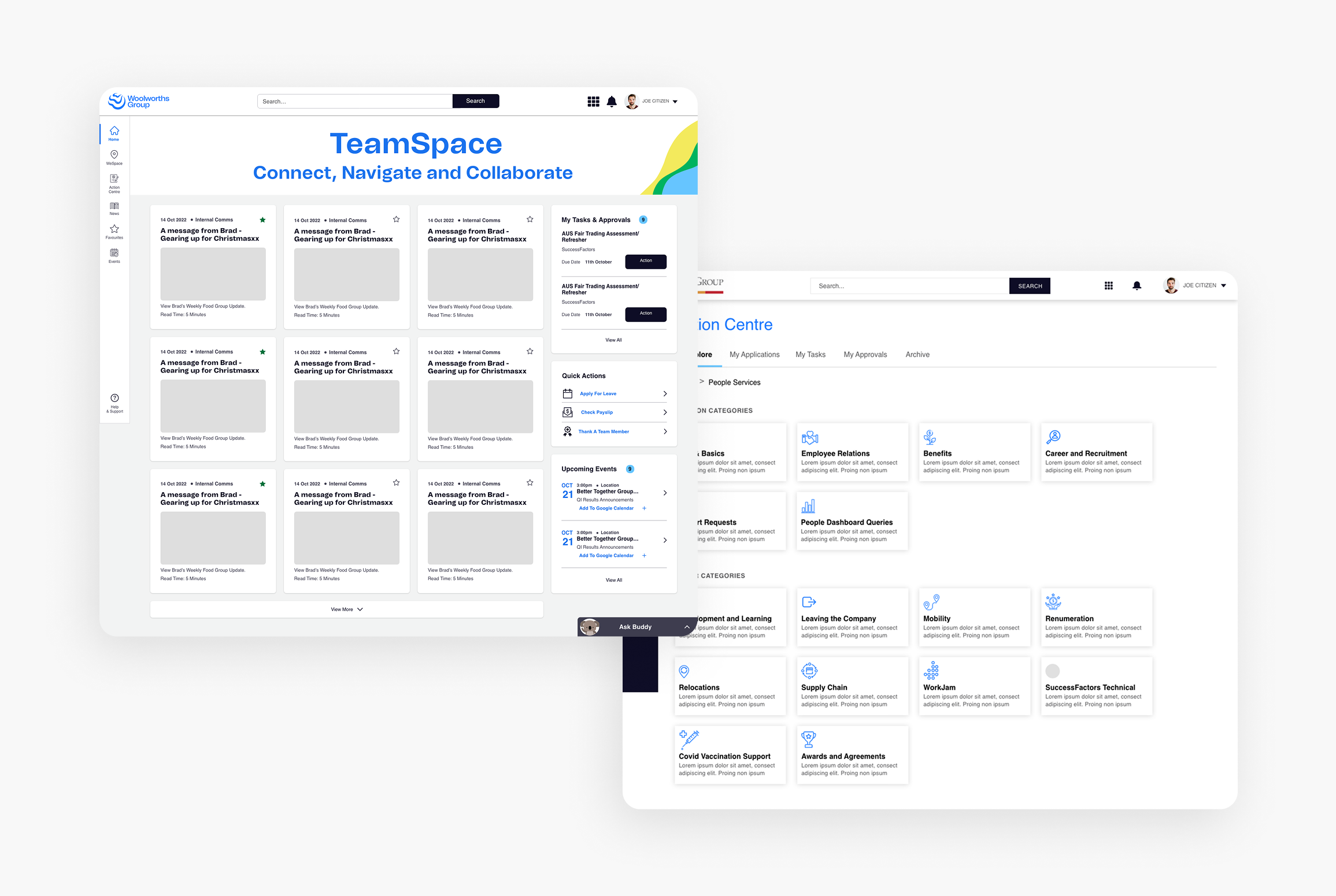
When I joined the project, Teamspace was broken:
Fewer than 40 weekly users out of 10,000+ staff
No clear purpose or value proposition
A fragmented digital ecosystem of hundreds of inconsistent team sites
A confusing knowledge hub filled with dense, contradictory policy documents
A blocked internal team under pressure to show value or face disbandment
The initial brief? A visual refresh. Early research revealed this would be superficial - the platform didn't need a new look. It needed a reason to exist.
Before: TeamSpace was a cluttered, rarely accessed and directionless platform
The turning point: from designer to strategic partner
I had a pivotal conversation with a key project leader. My assessment: minor uplifts wouldn't solve the core issue of user value. We could refine endlessly, but without fundamentally rethinking the platform's purpose, it would fail.
This conversation began a shift of my role from execution-focused designer to strategic partner responsible for shaping the product's direction. I earned clearance to pause superficial work and answer the real question: What job does this platform need to do for Woolworths' employees?
Building alignment through employee-centred research
I facilitated a crucial alignment workshop with the project's leadership team. To gain support for the strategic approach, I made the employee experience tangible:
I developed a comprehensive employee journey map based on dozens of interviews, breaking the lifecycle into four stages: Getting started & onboarding, Daily life & support, Career growth & progression, and Moving on & offboarding.
Each stage highlighted significant experience issues - for example, an employee struggling to find clear answers on bereavement leave amidst dense legal policies. We reinforced these stories with data: employees' belief in their career future at Woolworths dropped from over 70% to 44% after three years.
The journey map brought systemic issues into focus for the entire team and clarified the opportunity we had to solve them.
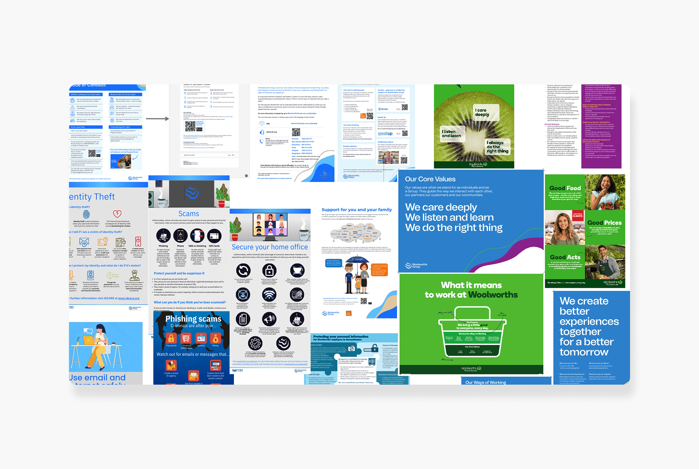
A small selection of assets used to help drive our vision for the platform re-design.
The strategy: build an indispensable daily tool
With leadership support, I led the design of the new platform from the ground up. The focus: create an active, indispensable daily tool, not a passive news feed.
Transforming the homepage into a personalised dashboard
Surfaces relevant news (team birthdays, company events)
Integrates personal calendar with company-wide events
Dedicated 'Actions' section for core tasks (book leave, view payslip)
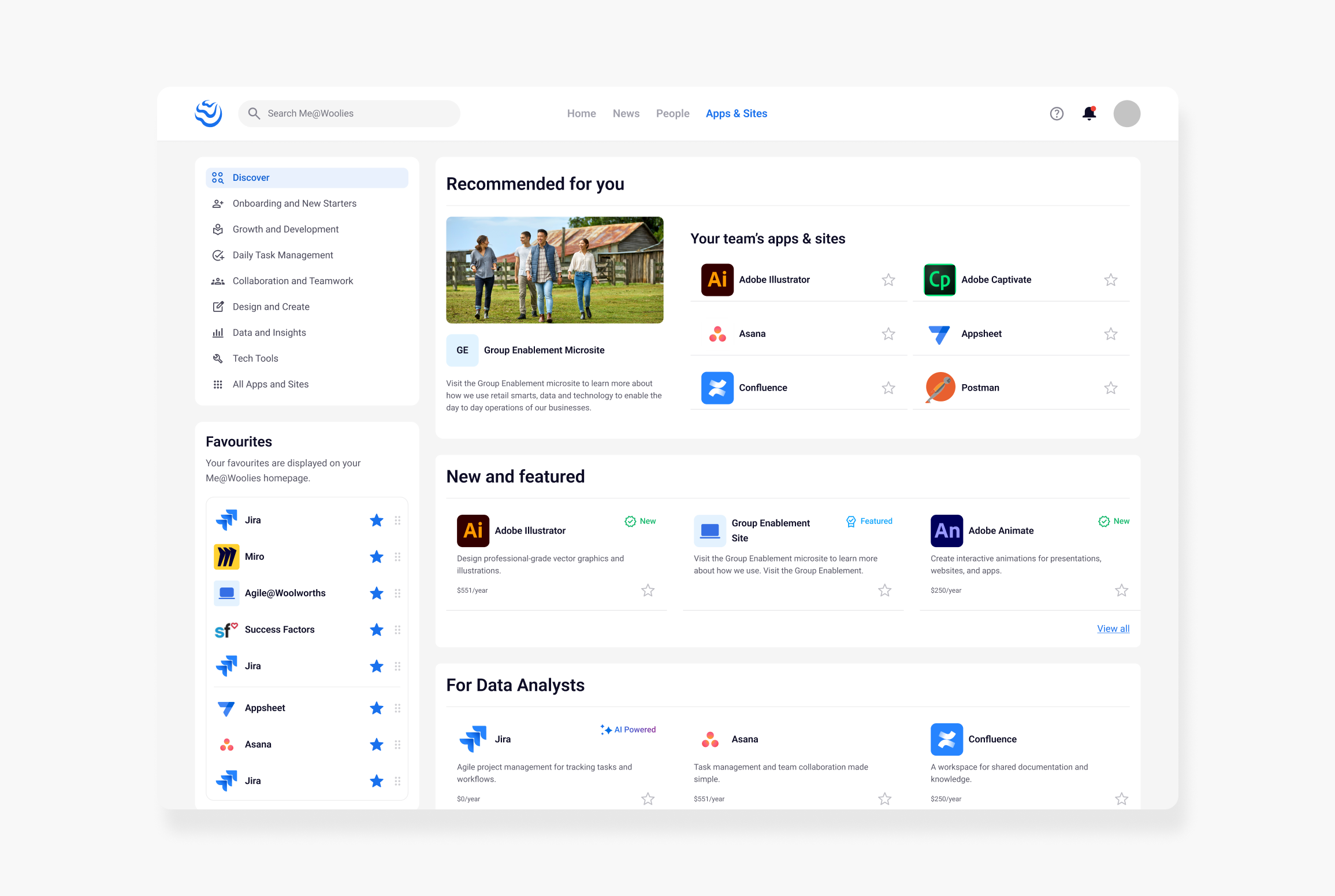
Quick access to bookmarked apps
High-value widgets: rewards points, leave balance with gentle prompts for unused leave
Developing a centralised, trusted source of truth
Research showed employees desperately needed a place to get answers to their questions about working at Woolworths. The existing knowledge portal was a major source of frustration.
I absorbed and restructured its content, elevating this from a simple migration to a core strategic pillar. Inspired by large, highly organised sites like GOV.UK, I designed a task-oriented information architecture based on our research. Clear, journey-based sections (Pay, Leave, Careers) replaced vague categories like "Pay and the Basics."
A content-first approach to policy
For sensitive topics like bereavement leave, I designed a content-first experience: the page itself provides a clear, human-readable summary of the entitlement, with the full policy available as secondary reference. This small but significant change demonstrated our new user-first approach—moving from hunting to immediate clarity.
The new homepage brings key info together with widgets for Today, office availability, leave balance and benefits.
The updated company information pages. Clear navigation, visuals showing who the content is for and plain-English answers instead of lengthy pages of policy text.
Navigating organisational constraints with pragmatism
My vision for the new knowledge hub section was for it to be the single source of all official company information, which meant eliminating hundreds of duplicative, inconsistent and inaccurate team sites.
I advocated for this, but lost the battle. Business units continued to have their own dedicated sites. Instead of accepting defeat, I pivoted: I led the effort to create standardised, accessible, easy-to-use site templates within the new 'Sites' section. While content duplication remained, we solved the larger problems of inconsistency, poor quality, and lack of governance.
A pragmatic compromise that delivered value within complex organisational constraints.
Cross-functional collaboration to deliver the vision
I was responsible for driving the design vision, but this transformation required close partnership with a talented cross-functional team. I worked with a brilliant product manager who supported our new direction and skilled developers who delivered a custom Salesforce experience in limited time. My role was often to bridge these stakeholders, ensuring our path forward was ambitious, user-centric and technically viable.
Before: scattered and inconsistent
After: accessible, organised and consistent
The results: massive engagement and lasting change
Measurable impact
Weekly active users grew from ~40 to over 85% of Australian staff (10,000+) and 96% of New Zealand staff
Won the Woolworths Group Innovation Award two years in a row
Positive user sentiment: now a trusted resource praised for ease of use and convenience
Scaled for the organisation
The design and structure of the knowledge pages was later adapted and rolled out to the entire 200,000+ store team network, forming the foundation of their knowledge base—the design of which I also oversaw.
A legacy of design maturity
The user-centred processes I introduced, including regular research cadences, continue today. My work helped get design a seat at the strategic table and built trust that now empowers the team evolving the platform.
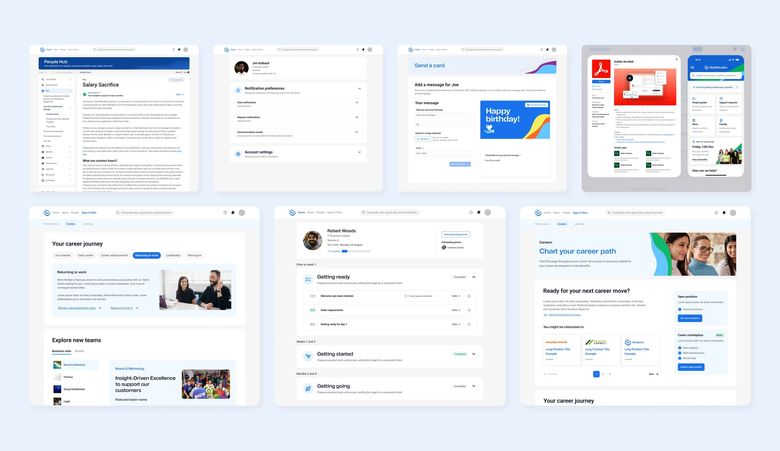
Teamspace continues to grow as the central hub for team members, supporting everything from careers and onboarding to benefits, training, celebrations, and everyday tasks.
A growing platform designed to scale - now the central hub for information, tools and experiences within the organisation.
Lessons learned
In a stalled system, the first job is to create momentum, not perfection.
Taking action - having candid conversations and showing ambitious concepts - was essential to break the team's stagnation and earn runway for future, more methodical work. Sometimes the most strategic move is simply to get the team unstuck.
Influence isn’t granted it’s earned through trust
I didn't start with a seat at the strategic table. I earned it by listening deeply, making user pain understandable and consistently demonstrating a path to a better experience. That trust became capital that created lasting change.
In complex organisations, pragmatic compromise is a form of winning
Losing the battle over eliminating team sites taught me that success isn't always about achieving an ideal vision; it's about navigating political realities to deliver the best possible outcome within given constraints.
A final reflection on growth
This project was a period of great professional growth. I was entrusted with significant responsibility and, in many ways, thrown in the deep end to lead the design effort. Rising to that challenge taught me how to navigate complex organisational politics, build trust with senior leadership and make strategic decisions. It solidified my capabilities as a strategic designer, moving beyond execution to shape a product's future.
Ultimately, real success came months later: seeing a team member open their browser and have the platform I designed appear as their homepage, using it not because they had to, but because it made their life at work a little bit better.


