WaterIQ: how strategic UX transformed organisational thinking and a rejected portal
How strategic user research transformed a rejected government portal into a valued tool - shifting organisational mindset and creating a roadmap to lift adoption from <10% to 80%.
Research • Product Strategy • UI Design • Accessibility •Prototyping

Queensland's commercial water users must obtain water entitlements, manage licenses, and record their water usage - mandatory regulatory requirements. A government portal existed to make this process digital and streamlined, but with <10% adoption, most users chose to email PDF forms instead. Through research with 19 users, I uncovered why: the portal offered zero value beyond basic compliance and broke their trust.
As UX Lead, I drove the research, strategy and design that transformed WaterIQ from a rejected digital option into the preferred choice. The engagement led to a strategic transformation - moving stakeholders from “users are the problem” to “our product is the problem”.
I collaborated with another designer and worked closely with client stakeholders and the Queensland Government's Design Systems team
Water is one of Queensland's most precious resources. Commercial usage is tracked and regulated to ensure a healthy, sustainable system for the state's farmers and irrigators - vital to their livelihoods.
The WaterIQ portal was built to streamline mandatory water meter submissions, but it was failing badly. Adoption sat below 10%, with most users bypassing the portal to email PDF forms - costly and error-prone for the department.
The department’s initial assumption blamed user digital literacy.
My research revealed far more complex issues. The engagement evolved from UI simplification to diagnosing why the portal was actively pushing users away - and how to rebuild broken trust.
The challenge: a system actively pushing users away

The original portal: a cluttered, information-dense interface that users found overwhelming and confusing. Our audit revealed it also failed critical accessibility standards, creating significant barriers for many.
Research approach: building trust to uncover truth
I conducted 19 in-depth interviews, including three farm visits, split into research sprints rather than repeating fixed sessions. This let us adapt our approach as we learned, testing evolving concepts with AI-built prototypes between sprints.
A pivotal realisation shaped the entire project: Our sessions were often the first time users felt heard by the department. Many were so frustrated they launched into complaints before I could begin my planned research. This revealed both critical usability issues and a profound breakdown of trust between users and the department.
I adapted my research method to give participants space to be heard first, transforming their frustration into constructive, honest feedback.
Between sprints, I rapidly prototyped concepts, developed user archetypes, and mapped their journeys. The intense cadence was challenging but enabled richer insights than a fixed methodology would have allowed.
Interactive AI-built prototypes, rapidly created between research sprints to test ideas and information architecture. Splitting the 19 sessions into sprints let us adapt and evolve as we progressed.
My research synthesised the portal's rejection into three interconnected issues:
Critical login friction: The mandatory myID authentication was disproportionate to the task and created operational bottlenecks by tying portal access to a single individual - a major problem for farm businesses.
Zero perceived value: The portal was pure one-way data entry. It took users' time and data but gave nothing back - no usage trends, historical data, or actionable insights to help manage their businesses.
Cluttered and inaccessible: The information-dense design was mentally overwhelming and failed critical accessibility standards, especially for users with vision impairments using scaled-up browsers.
The result? Active rejection. Why struggle through authentication when a simple PDF form respects their time and works?
Research synthesis: three critical failures
“It’s easier to transfer $100,000 with my bank than it is to log into this system and share my water usage”
- Water user
A journey map used to help stakeholders see usability challenges with the current state experience and failures to meet the government’s digital service standards.
Strategic reframe: from compliance burden to trusted partner
Armed with evidence, I proposed a fundamental reframe. Rather than simply ‘fixing’ the portal, we needed to transform it from a compliance burden into a tool that offered genuine value.
The organisational challenge: Government stakeholders were risk-averse and skeptical that UX investment would drive adoption. I positioned the three-horizon approach as a way to deliver incremental, measurable value while de-risking the transformation - proving impact early before committing to bigger changes. This framing shifted the conversation from an large redesign to a strategic pathway to measurable outcomes.
I developed a three-horizon strategic roadmap to deliver immediate improvements while building toward an ambitious future:
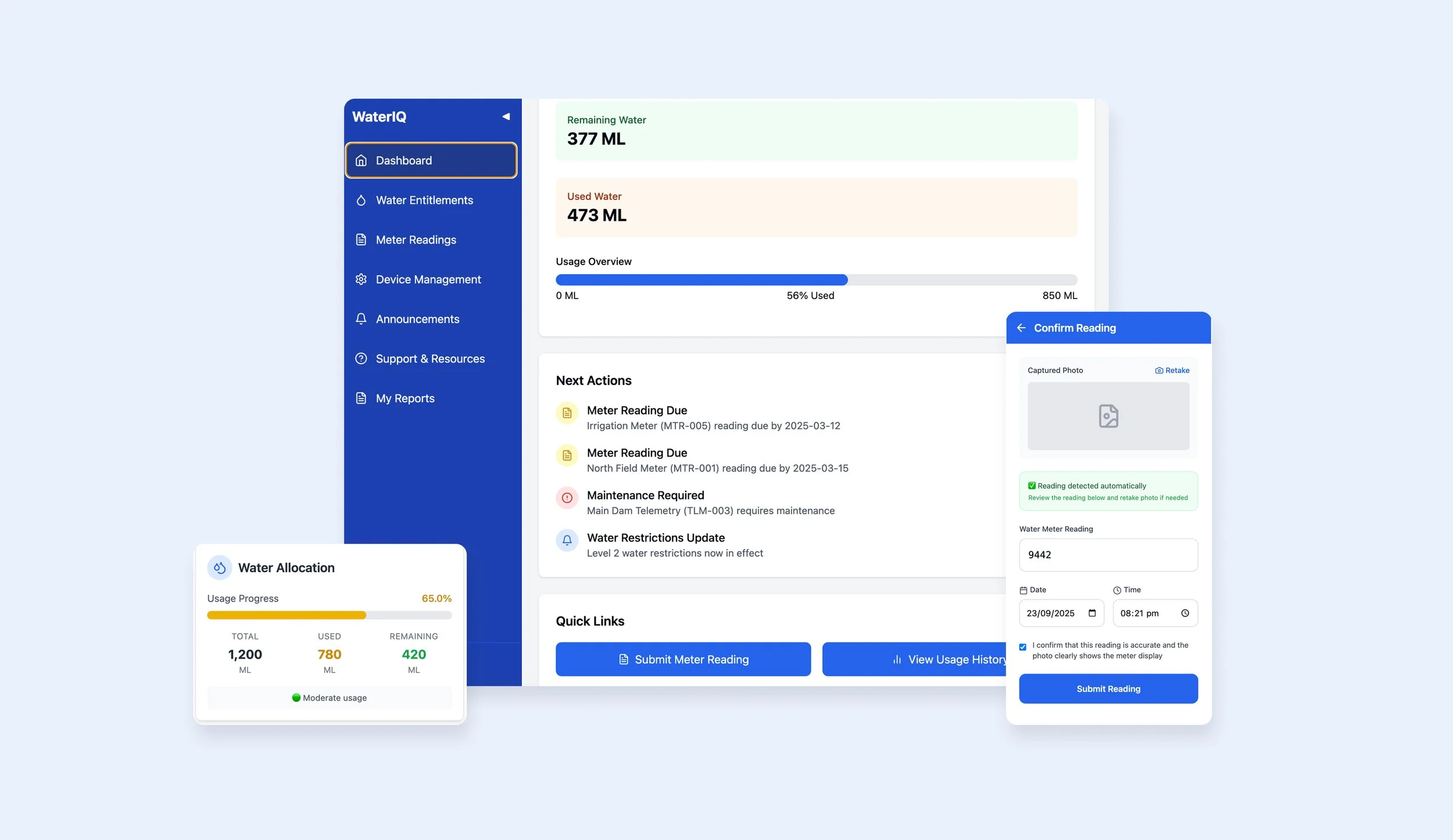
Horizon 1: Build a usable, accessible foundation: Migrate to Queensland's design system, fix critical accessibility failures, and launch a simple dashboard showing users what they actually need: total allocation, water used, and amount remaining. Give them value immediately.
Horizon 2: Compete with the PDF: Introduce delegatable, simplified login to address the #1 workflow bottleneck. Make the digital experience easier than the analog alternative.
Horizon 3: Become the preferred system: With trust re-established, deliver deeper value through usage trends, insights, alerts, and high-value workflows like water trading. Transform the relationship from mandatory compliance to valued partnership
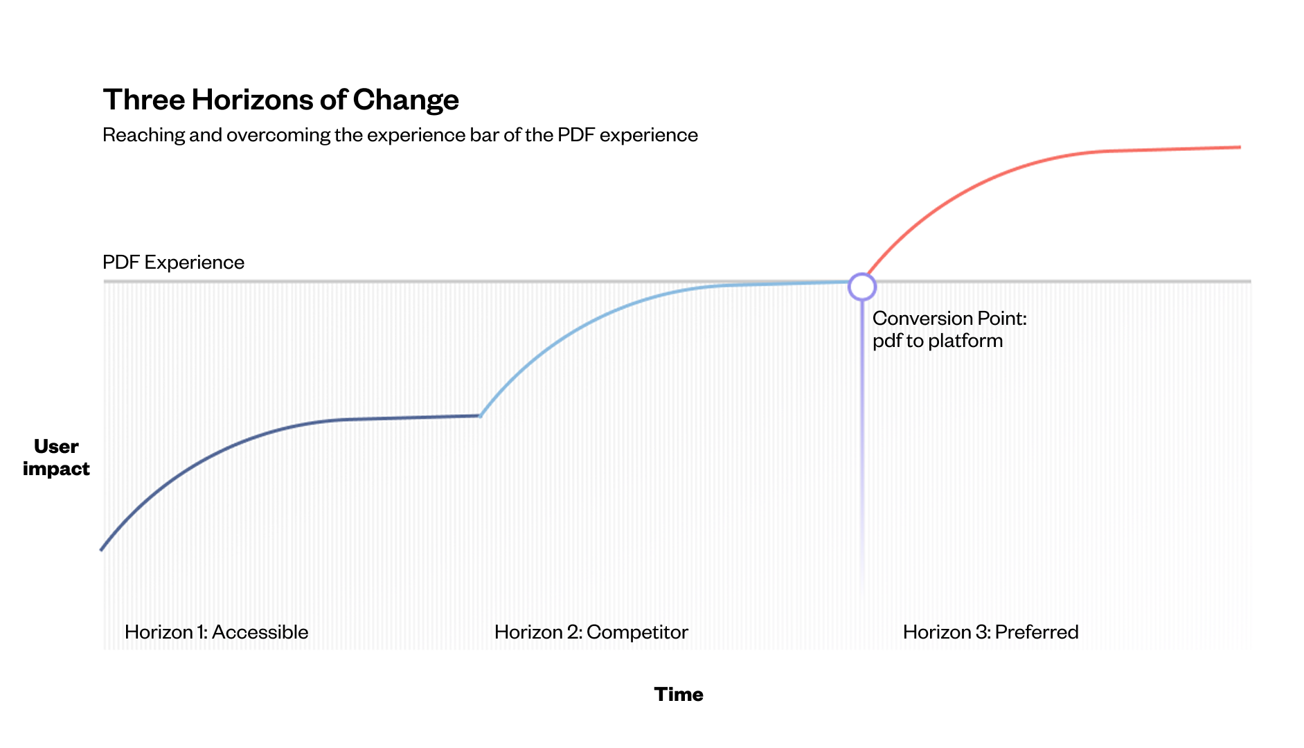
3 horizons of change to reach wide digital adoption.
Design execution: clarity and accessibility as foundations
The redesigned experience was built on two core principles: immediate value and universal accessibility.
The new dashboard answers users' key questions the moment they log in - empowering them with insights for strategic planning while making core tasks like submitting readings obvious. We consolidated device information into clean, scannable layouts and streamlined the submission workflow.
The companion mobile app extends this clarity into the field with core information and timely alerts, offering a tailored ‘in-the-field’ experience that gets users into their tasks in seconds.
We worked in close collaboration with the Queensland Government Design System team, implementing their standards while contributing new, bespoke components aligned with their work for future reuse across government services.

Delivering immediate value. We designed the new dashboard to answer users' key questions the moment they log in, empowering them with the insights needed for strategic planning while making core tasks like submitting a reading obvious. The companion mobile app extends this clarity into the field with core information and timely alerts.
Driving organisational change
The project's biggest challenges were often internal. I navigated shifting stakeholders and a prevailing mindset that compliance tools don't need good UX.
I used research to tell human stories behind the data, showing how poor experience was actively damaging the department's relationship with its community.
When our primary contact changed mid-project, we ran workshops to build understanding of accessibility and user-centric design - helping new stakeholders understand the importance of delivering a valuable, compliant experience that rebuilds trust.

Streamlining a core task. We consolidated all device information into a single, clean layout and allowed users to submit a reading directly from the detail page. The mobile app offers a tailored 'in-the-field' experience, getting users into their task in seconds
Impact: shifting mindset and unblocking progress
Shifted the organisational narrative: Moved the internal conversation from “users are the problem” to “our product is the problem” - creating buy-in for a bold, user-centric strategy.
Unblocked a paralysed team: Delivered a clear, evidence-based roadmap that gave a team stuck with a failing product the confidence and direction to move forward.
Strong user validation: The redesigned concepts were met with enthusiasm in testing. Participants expressed they would gladly adopt a portal that offered tangible value - a complete reversal from their previous rejection.
My strategic recommendations and designs have been adopted. Horizon 1 designs are now being built, with the next phases planned to bring these solutions to life.
Personal reflections
The moment that stayed with me: a farmer in our final testing session leaning back and saying, 'This is it - I'd actually use this.' After months of hearing frustration and distrust, that simple statement of trust restored felt like the real measure of success. Good government UX means rebuilding the relationships between institutions and the communities they serve.

Building on a foundation of consistency. We worked in close collaboration with the Queensland Government Design System (QGDS) team, implementing their standards and contributing new, bespoke components that were aligned with their work and could be reused in the future.